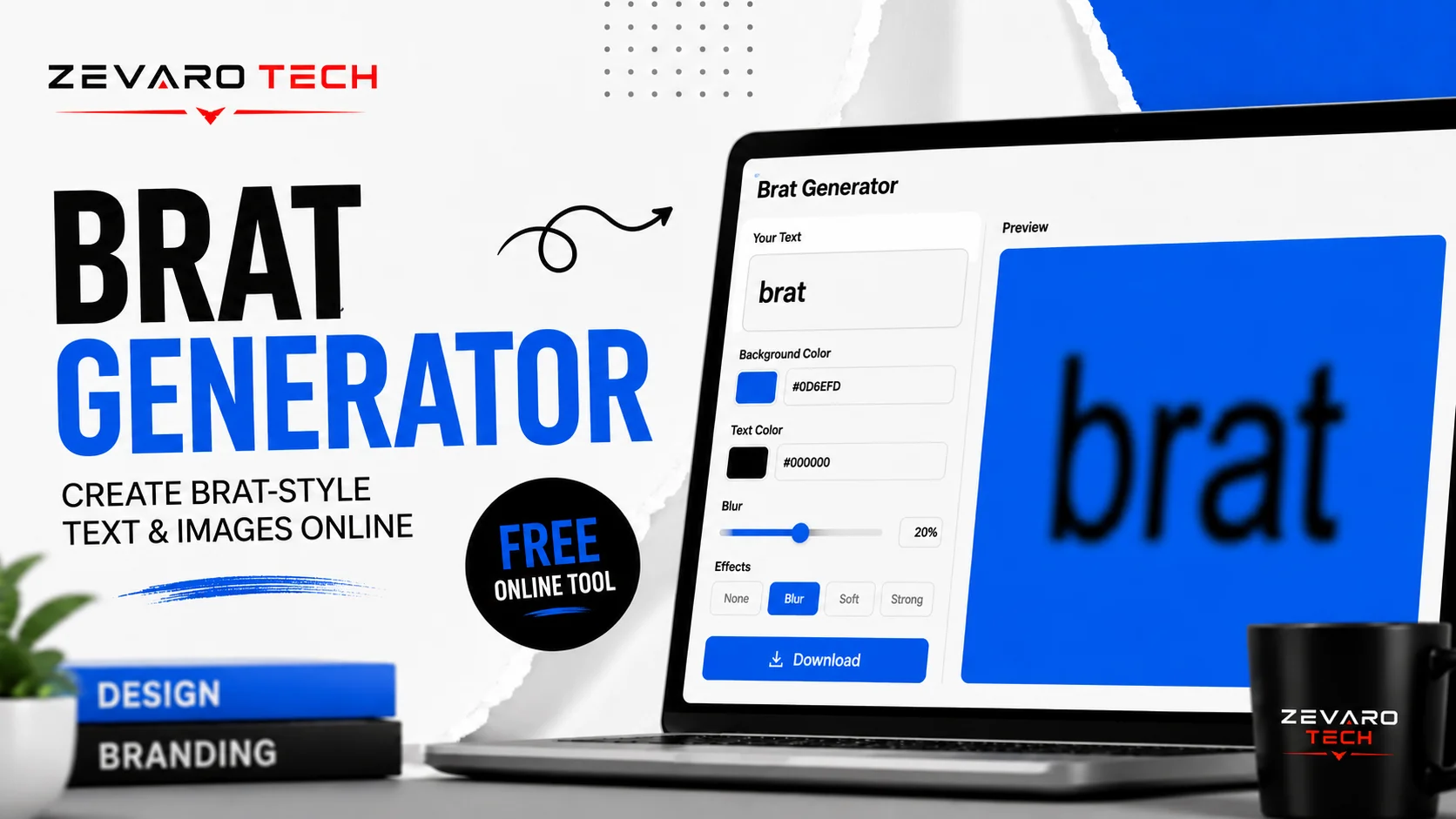
A Brat generator is an online tool for creating custom images inspired by the visual style of Charli XCX’s BRAT album. Users can enter their own text, customize available design settings such as color and blur, preview the result, and download the finished graphic, depending on the generator’s features.
Free Brat Generator
Create a custom Brat-style image in seconds. Enter your text, adjust the look with the available controls, preview the result instantly, and download the finished graphic when it looks right. No design software or complicated editing workflow is needed.
Customize Your Brat Design
A good Brat generator should give you enough control to make the design feel intentional without turning the process into a full graphic-design project. Start with your text, refine the colors and visual effects, check the preview, then export the finished image.
Text
Enter a name, phrase, album title, lyric excerpt, meme caption, or other short text. Keep it concise for a cleaner, more recognizable Brat-inspired result.
Colors
Adjust the background and text colors to create the look you want. The classic lime-green aesthetic works well, but alternative color combinations can give your graphic a different personality.
Blur & Effects
Fine-tune blur and other available effects to control how sharp or imperfect the text appears. A subtle effect can create a more convincing visual treatment without making the text difficult to read.
Download Options
Once the preview looks right, export the finished design using the available download option and format. Check the final image before sharing it on social media, using it as cover art, or adding it to a project.
What Is a Brat Generator?
A Brat generator is an online image-making tool designed to create graphics inspired by the visual style associated with Charli XCX’s BRAT album. Instead of manually recreating the typography, background, spacing, and effects in Photoshop or another design program, you enter your own text and let the generator handle the visual composition.
The appeal is speed and simplicity. You can turn a short phrase such as “late night,” a person’s name, a playlist title, or a meme caption into a Brat-inspired graphic without needing advanced design skills.
A useful generator should also give you control over the elements that affect the final appearance, such as text, colors, blur, and export settings. That makes it useful for more than simply reproducing one fixed design.
Expert tip: For a stronger result, start with short text. Long sentences can make the graphic feel crowded and reduce the impact of the typography.
What Does a Brat Generator Create?
A Brat generator can turn custom text into graphics for a range of personal and creative uses, depending on the features available in the tool.
Common examples include:
- Custom text graphics — Create a Brat-inspired version of your name, phrase, or caption.
- Album and playlist covers — Turn a title into cover artwork for personal music projects or playlists.
- Memes — Add short, humorous phrases to a recognizable visual style.
- Social media graphics — Create simple visuals for posts, stories, or profile content.
- Personalized designs — Experiment with names, inside jokes, event titles, or short quotes.
- Profile images and wallpapers — Adapt short text into graphics for personal digital use.
The best use case depends on the generator’s customization and export options, so check the available controls before choosing a tool for a specific project.
How to Use the Brat Generator
Creating a Brat-style image should take only a few simple steps. You don’t need to understand graphic design or recreate the look manually. Enter your text, adjust the visual settings, check the preview, and download the result.
Step 1 — Enter Your Text
Type the name, phrase, caption, playlist title, or other short text you want to turn into a Brat-style graphic. Shorter text usually creates a cleaner result.
Step 2 — Customize the Design
Adjust the available design controls, such as background color, text appearance, blur, or other effects. Experiment until the typography and overall composition feel balanced.
Step 3 — Preview Your Image
Check the live preview before exporting. Look for awkward spacing, difficult-to-read text, excessive blur, or a layout that doesn’t fit your intended use.
Step 4 — Download Your Image
When you’re happy with the result, use the download option to save the finished image in the available format. Open the file once before sharing to confirm the export looks correct.
What Makes the BRAT Visual Style Distinctive?
The BRAT aesthetic works because it is deliberately simple. The cover doesn’t rely on complex illustrations, detailed backgrounds, or layers of decorative elements. Instead, its impact comes from a small set of recognizable choices: bold typography, lowercase text, a striking green background, and a deliberately rough or blurred appearance.
That simplicity is also what makes the style easy to imitate—but difficult to reproduce convincingly. Small differences in letter proportions, spacing, color, or blur can make a generated graphic feel noticeably different.
The Typography
Typography does most of the visual work. The BRAT treatment uses large, lowercase sans-serif lettering with a condensed, heavy appearance that gives the text a strong presence without requiring additional graphics.
When recreating the aesthetic, focus on the overall typographic character rather than assuming there is one universally confirmed “BRAT font.” Font approximations can produce different results depending on letter width, weight, spacing, and rendering.
Lowercase Text
The lowercase treatment is a major part of the visual identity. Compare the difference between BRAT and brat: the second feels less formal and more understated, while still being visually prominent.
For a closer stylistic result, use short lowercase words or phrases and avoid unnecessary capitalization.
Color and Contrast
The bright green background is one of the most recognizable elements of the BRAT artwork. It creates immediate contrast with the darker lettering and allows the otherwise minimal composition to stand out.
If your generator offers color controls, start with the classic green-inspired treatment, then test alternatives when creating a personalized graphic. Don’t claim an exact HEX or RGB value unless the value has been reliably verified.
Blur and Imperfection
The slightly rough, low-resolution appearance is part of the appeal. The text doesn’t need to look perfectly polished or digitally pristine.
A controlled amount of blur can soften the lettering and reproduce that imperfect feel. Too little may look overly clean; too much can make the words difficult to recognize. The best approach is to compare the preview at normal viewing size and reduce the effect whenever readability suffers.
What Font Does the BRAT Album Use?
The typography on Charli XCX’s BRAT album cover is one of the key elements behind its recognizable look. Reliable references describe the cover lettering as lowercase Arial, while many online recreations use condensed or modified Arial-style fonts to approximate the original appearance.
That distinction matters: a “BRAT font” sold or offered by a generator is not necessarily an official standalone font released for the album. The safest approach is to describe these typefaces as BRAT-style approximations unless there is a verified source establishing otherwise.
Is There an Official “BRAT Font”?
There is no need to claim that a separate, officially released “BRAT font” exists. The album artwork is commonly described as using Arial in lowercase, while generators and fan recreations may modify the typography through width, spacing, scaling, or rendering effects.
For a generator, the goal should therefore be visual similarity rather than an unsupported claim that it uses an “official BRAT font.” This also gives users a more accurate understanding of why different BRAT generators can produce slightly different results.
Common BRAT-Style Font Approximations
| Font / Style | Visual Similarity | Key Characteristic | Recommended Use |
|---|---|---|---|
| Arial | High | Simple sans-serif form used in descriptions of the original artwork | Closest general reference |
| Arial Narrow | High | More condensed proportions | Compact BRAT-style text |
| Condensed sans-serif | Medium–High | Narrow, bold letterforms | Short phrases and headings |
Expert tip: Don’t judge the typeface alone. The BRAT look also depends on lowercase lettering, scale, spacing, color, and the deliberately imperfect rendering of the final artwork.
What Color Is BRAT Green?
The BRAT album cover is strongly associated with a distinctive lime green, identified by GRAMMY.com as Pantone 3507 C.
You will find different HEX values published online for digital recreations, including #8ACE00. However, HEX conversions can vary depending on the source and color-management method, so an exact digital value should not automatically be presented as an official HEX code.
For a generator, the practical approach is to provide a clearly labeled BRAT-inspired green preset and allow users to adjust the shade when needed.
Why the Green Became So Recognizable
The color works because it is intentionally difficult to ignore. Instead of a conventional pastel or polished album-cover palette, the BRAT artwork uses a saturated lime green with simple lowercase typography. Charli XCX described the shade as deliberately “off-trend,” reinforcing the unconventional visual direction.
The combination of an unusual green, minimal composition, and plain typography made the artwork immediately recognizable even without a photograph of the artist.
What Can You Create With a Brat Generator?
A Brat generator is useful whenever you want the recognizable visual treatment without building the design manually. The simplest use is a custom text graphic, but the same approach can work for personal projects, social content, playlists, memes, and other digital graphics.
Brat-Style Album Covers
Create a custom cover using an album title, artist name, project name, or short phrase. Keep the wording concise so the typography remains the visual focus.
Playlist Covers
Turn a playlist name such as “late night”, “summer chaos”, or “gym songs” into a simple Brat-inspired cover. This works particularly well when the title is short.
Brat-Style Memes
Use short punchlines, reactions, or inside jokes to create simple meme graphics. The minimalist format can make a short phrase more noticeable than a crowded meme template.
Social Media Graphics
Create graphics for Instagram posts, stories, TikTok content, or other social platforms. Match the canvas size to the platform before downloading so the text doesn’t become cropped or difficult to read.
Profile Pictures & Avatars
A short name, nickname, or single word can work well as a profile graphic. For small displays, prioritize large lettering and strong contrast rather than long phrases.
Brat Generator vs. Other Ways to Create Brat-Style Images
A dedicated Brat generator is usually the quickest option when the goal is a specific Brat-inspired text graphic. Design platforms offer more flexibility, while professional editors provide the most control but require considerably more setup.
| Method | Ease of Use | Speed | Customization | Design Knowledge |
|---|---|---|---|---|
| Brat Generator | Very easy | Very fast | Focused | Low |
| Canva | Easy | Fast | Broad | Low–Medium |
| Photoshop | Advanced | Slower | Extensive | High |
| Manual Font Editing | Moderate | Slower | Focused | Medium |
These are practical editorial comparisons rather than standardized performance scores. The right choice depends on how much control you need. If you simply want custom Brat-style text, a dedicated generator removes most of the unnecessary setup. If you’re building a complete campaign, poster, or multi-element composition, a general design application may be more appropriate.
Brat Generator Features to Look For
Not every generator offers the same level of control. Before choosing one, check whether it handles the basics well and whether its limitations match your intended use.
Free Generation
The word “free” should be clear about what it actually includes. Check for usage limits, premium controls, download restrictions, or unexpected signup requirements rather than assuming every advertised feature is free.
Custom Text
A useful generator should let you replace the default word with your own text. Test both short words and slightly longer phrases to see how the layout responds.
Color Controls
Look for a recognizable BRAT-inspired green preset as well as custom color controls. This is useful when creating variations for different projects.
Blur Controls
If the generator includes blur, a slider or adjustable control is more useful than a fixed effect. You can then balance the intentionally imperfect appearance against basic readability.
High-Quality Download
Check the actual output dimensions and available file formats. A preview can look sharp in a browser while the downloaded file is too small for its intended purpose.
Mobile Support
The interface should remain usable on a phone, with readable controls, a responsive preview, and an accessible download button. A generator that only works comfortably on desktop limits its usefulness for social-media creators.
No Unnecessary Signup
If the tool doesn’t require an account, that can make the workflow considerably faster. If signup is required, explain why rather than hiding it until the user reaches the download stage.
Privacy Transparency
Users should be able to understand what happens to the text or images they enter. If processing happens entirely in the browser, state that only when the implementation has been verified. If data is uploaded or stored, explain the relevant policy clearly instead of making a blanket “nothing is stored” claim.
Common Brat Generator Mistakes
A Brat-style graphic can look noticeably different from the intended aesthetic even when the basic ingredients are there. The most common problems usually come from typography, spacing, excessive effects, or using the wrong image dimensions.
Using the Wrong Typography
Typography carries much of the visual identity. A font that is too wide, decorative, thin, or rounded can make the result feel like a generic text graphic rather than a Brat-inspired design.
Before: Wide or decorative lettering with heavy styling.
After: Simple, bold, lowercase sans-serif typography with a cleaner visual presence.
Using Too Much Text
Long sentences can quickly overwhelm a minimalist design. The more words you add, the harder it becomes to maintain the strong visual impact of large typography.
Better approach: Use a short name, phrase, title, or punchline. If the message needs more context, keep the main graphic concise and place the additional information elsewhere.
Incorrect Spacing
Even the right font can look wrong when the letters are cramped or spread too far apart. Excessive margins can also weaken the composition.
Visual check: Look at the relationship between the text, canvas edges, and background. The design should feel intentional rather than squeezed into the available space.
Overusing Effects
Blur can contribute to the imperfect character of a Brat-inspired graphic, but more isn’t always better. Excessive blur, shadows, outlines, or filters can make the text muddy and difficult to read.
Before: Heavy effects that obscure the letters.
After: A controlled effect that adds texture while preserving readability.
Ignoring Image Dimensions
A design that looks good in the generator may not work everywhere. Cropping can occur when an image is resized for a social post, profile picture, story, or other format.
Before downloading, consider where the graphic will be used and choose an appropriate canvas size whenever the generator provides that option.
Copying the Style Too Literally
Expert tip: A Brat-inspired graphic doesn’t need to reproduce every detail of the original artwork. Use the recognizable visual principles—simple typography, strong color, minimal composition, and controlled imperfection—while creating something specific to your own purpose.
How to Make a Better-Looking Brat-Style Image
The strongest results usually come from restraint. You don’t need a complicated composition; you need the few important elements to work together.
Keep the Text Short
Expert tip: Start with one word or a short phrase. Short text gives the typography room to dominate the composition and makes the final graphic easier to read at smaller sizes.
Prioritize Contrast
Your text should remain clearly visible against the background. If the colors are too similar, the graphic loses impact and becomes harder to read.
Test the design at both full size and thumbnail size. If the wording disappears when the image is viewed small, increase the contrast or simplify the design.
Use Consistent Alignment
Choose an alignment and stick with it. Centered text can create a balanced, poster-like composition, while deliberate off-center placement can feel more unconventional.
Design check: Compare the text position with the canvas edges rather than judging the letters in isolation.
Don’t Overcomplicate the Background
The minimalist character of the style is part of its appeal. Adding photographs, patterns, gradients, icons, or multiple decorative elements can shift attention away from the typography.
A simple background usually gives the text more visual authority.
Preview Before Downloading
Before exporting, run through a quick checklist:
- Is every word readable?
- Does the text fit comfortably?
- Is the color contrast strong enough?
- Is the blur subtle enough?
- Does the composition look balanced?
- Is the image size appropriate for its intended use?
A few seconds of checking can prevent an otherwise good design from being ruined by a small spacing, cropping, or readability issue.
Brat Generator Examples
Seeing actual outputs is often more useful than reading a list of features. A strong example gallery should demonstrate different types of text, layouts, and use cases rather than showing the same design repeatedly.
Text Examples
Try short names, single words, captions, or phrases to demonstrate how different lengths affect the final composition.
Album Cover Examples
Use concise fictional or personal titles to show how a Brat-inspired treatment can work as simple cover artwork.
Meme Examples
Short punchlines and reactions are a natural fit for the minimalist format. Keep the wording brief enough to remain visually dominant.
Social Media Examples
Show how the same concept can be adapted for different social formats, including square posts, vertical graphics, or profile content.
Custom Color Examples
Display several color variations alongside the classic green-inspired treatment. This demonstrates how changing the palette can create a personalized result while keeping the typography as the main visual element.
Is a Free Brat Generator Really Free?
“Free” can mean different things from one tool to another. Some generators may provide basic creation at no cost while limiting downloads, customization, usage volume, or certain premium features.
Before relying on a generator, check the actual interface and terms rather than assuming that every feature is unrestricted.
| Question | What to Check |
|---|---|
| Free to use? | Whether creating an image requires payment |
| Signup required? | Whether an account is needed before using or downloading |
| Watermark? | Whether exported images contain branding |
| Download available? | Whether the finished image can actually be saved |
| Usage limits? | Whether generation or downloads are restricted |
| Premium features? | Whether advanced controls require payment |
For this reason, a trustworthy generator should clearly explain what users receive for free before they spend time creating an image.
Privacy, Image Usage & Brand Disclaimer
A generator should be transparent about what happens when you enter text or upload an image. The answer depends on how the specific tool is built.
What Happens to Your Text or Images?
Check the tool’s privacy policy for information about collection, processing, storage, and deletion. If content is processed locally in the browser, that should be stated only when it has been technically verified. If content is sent to a server, users should be told what happens to it.
Avoid making blanket claims such as “your data is never stored” without evidence from the actual implementation and privacy policy.
Can You Use Generated Images?
Usage rights depend on the generator’s terms, the content you provide, and how the final graphic is used. A generator should clearly explain any restrictions that apply to downloads or commercial projects.
If you’re creating artwork for a business, paid campaign, product, or other commercial purpose, review the tool’s terms before publishing it.
Is This an Official Charli XCX Tool?
Unless the generator has a documented relationship with Charli XCX or the relevant rights holders, it should be described as an independent Brat-inspired tool, not an official Charli XCX product.
Using a recognizable artistic style as inspiration does not by itself establish an endorsement or affiliation. Clear wording helps users understand exactly what the tool is—and what it isn’t.
Brat Generator FAQ
What is a Brat generator?
A Brat generator is an online tool that creates custom graphics inspired by the visual style associated with Charli XCX’s BRAT album. You enter your own text and, depending on the tool, adjust elements such as color, typography, blur, and image settings before downloading the result.
Is the Brat generator free?
Many Brat generators offer free image creation, but the exact features vary. Some may limit downloads, customization, or usage. Check the tool’s pricing and feature information to confirm what is included at no cost.
Can I create custom Brat text?
Yes, a text-based Brat generator is designed to let you replace the default wording with your own text. Names, short phrases, playlist titles, captions, and meme text are generally better suited to this format than long paragraphs.
What font does the BRAT album use?
The BRAT artwork is commonly described as using Arial in lowercase. However, many recreations use condensed or modified sans-serif alternatives to achieve a similar appearance. It’s better to describe these as BRAT-style approximations rather than claim that one unofficial recreation is the definitive font.
What color is BRAT green?
The BRAT album artwork is strongly associated with a distinctive lime green. GRAMMY.com identifies the album-cover color as Pantone 3507 C. Digital HEX values found online can vary, so an exact HEX value should be treated as a digital approximation unless supported by a reliable source.
Can I create a Brat album cover?
Yes, a generator can be used to create Brat-inspired cover artwork with a custom title or other short text. If the design is intended for a real music release, review the relevant rights, platform requirements, and usage terms before publishing it.
Can I use a Brat generator on my phone?
A browser-based generator can be convenient on mobile, provided its interface is responsive. Look for controls that remain easy to use on a smaller screen and a preview that doesn’t require constant zooming or horizontal scrolling.
Can I download my Brat image?
This depends on the specific generator. Before creating an image for a project, check whether the tool provides a downloadable file and which formats and resolutions are available.
Can I change the background color?
Some generators provide a selection of preset colors, while others offer custom color controls. If color customization is available, you can move beyond the familiar green-inspired treatment and create a personalized variation.
Can I create Brat-style memes?
Yes. Short meme captions work particularly well with minimalist typography. For the clearest result, keep the wording brief and make sure the text remains readable after the image is resized for social media.
Is the Brat generator affiliated with Charli XCX?
Not necessarily. An independent generator should not be presented as an official Charli XCX product unless a documented relationship exists. A tool can create graphics inspired by the BRAT aesthetic without implying endorsement or affiliation.
Do I need an account to use the generator?
That depends on the individual tool. Some generators allow users to create and download images without an account, while others may require registration for certain features. Check the tool’s interface before starting if avoiding signup is important to you.
Final Verdict: Is the Brat Generator Worth Using?
A Brat generator is the practical choice when you want to create a Brat-inspired graphic quickly without manually rebuilding the design in Photoshop or another editor. It is especially useful for short text graphics, personal projects, playlists, memes, and social content.
The main advantages are:
- Speed: Create a graphic without starting from a blank canvas.
- Simplicity: No advanced design skills are required.
- Customization: Adjust supported text, colors, blur, and other visual settings.
- Convenience: Generate and download from a browser.
- Experimentation: Try different phrases and visual variations quickly.
If you need detailed control over an entire composition, professional design software remains more flexible. For a focused Brat-style graphic, however, a dedicated generator can remove much of the unnecessary work.
Ready to create one? Start with a short phrase, refine the visual treatment, preview it carefully, and download the version that looks right.